When running a website or blog, you’ll have to test and change some elements to improve user conversion and monetize better. For example, changing your website’s font or color could improve the user experience and conversion. With A/B testing, you can check your ideas and evaluate your visitors’ preferences to see if the proposed changes are worth it.
New to the topic? Don’t worry! This article will teach you what A/B testing is and how it works.
What is A/B testing?

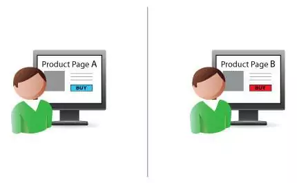
A/B testing involves comparing the effectiveness of two different versions of an element — a website, ad banner, popup, or text.
For instance, you could compare two different ad placements to see which one users click the most. A/B testing gives you valuable insight into where and how to spend your budget, as well as the courage to make potentially risky decisions.
Split or multivariate testing
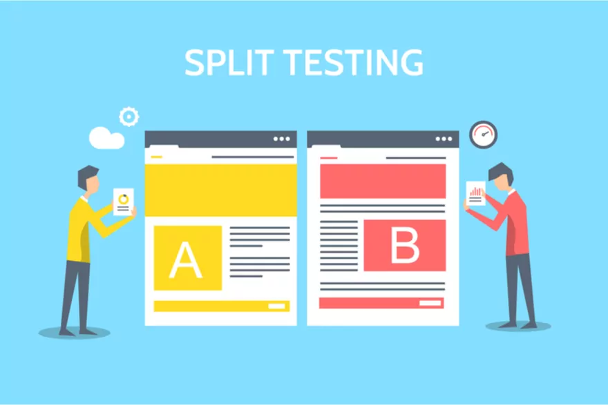
People use “split testing” and “A/B testing” interchangeably. Here’s the difference:
In split testing, traffic is evenly split between the two existing variations. In contrast, A/B refers to the two web pages or website variations competing against each other.
Split testing, like A/B testing, can compare two completely different styles of design, web content, or evaluate small changes to a single website element (such as a different image, header, call to action, button color, signup form, etc.).
Users are split into two groups: half will see the original version (the control or A), and the other half will see a new version (the variation).
Why is A/B testing important?
Accurate A/B tests can make a significant difference in your ROI. You can figure out which marketing strategies work best for your company and product by conducting controlled tests and collecting empirical data.
Testing, when done consistently, can significantly improve your results. In the long run, it’ll be easier to make decisions and craft more effective marketing strategies because you know what works best for you.
Let’s discuss some advantages of running A/B tests on your website:
- You’ll learn more about your target audience. Split or multivariate testing ensures that decisions aren’t based on intuition or guesswork. When it comes to predicting what users will respond to, even the most seasoned marketers, designers, and copywriters can be wrong. Split testing lets your users make the decisions for you.
- Higher conversion rates: Knowing what works and what doesn’t can provide helpful information to streamline the conversion process.
- Keep up with the latest trends: It’s difficult to predict how people will react to certain types of content, images, or other features. Regular testing allows you to stay on top of changing consumer behavior.
Increase dwell time: When visitors like the content on your site, they stay longer. Experimenting on what kind of content or ads your users prefer will help you build a better website — one that they’ll want to stay on.

Top website A/B tests
Optimizing conversion rates is difficult, especially if you’re just starting in your niche. A/B testing features on your website is one of the best ways to improve Conversion Rate Optimization (CRO).
The real difficulty with improving CRO is figuring out where to begin and what to test.
One thing to remember is that testing every conceivable aspect of your website can be counterproductive. You can waste time and money on software, employees, and consultants to test things that will not increase your website’s revenue enough to justify the tests.
So, consider what you aim to achieve and take a look at the following tests.
1. A/B test for typography
Typography has a significant impact on conversions, but randomly testing each Google font won’t get you anywhere. Before getting too specific with typefaces, you should test a few aspects of typography.
- Serif vs. sans serif
Serif typefaces have flourishes and are accented with different widths for each line in a character (Times New Roman). Sans serif typefaces are the polar opposite, with a consistent width and no serifs (like Arial).
Check out our guide to using fonts to understand which fonts are better for your website. In general, sans serif fonts are better looking on the web. But you’ll never know if you don’t test.
- Colors
Always use black (dark) text on a white (light) background for your blog, long-form copy, and the majority of the text on your website. It’s a classic color scheme that your visitor’s eyes have adapted to.
Test each of the primary eight colors (of the rainbow) for your CTAs and other smaller, more impactful text elements. Always remember that users click what stands out.
- Font Size
Tahoma is the most legible font at 10 px, followed by Verdana and Courier at 12 px, and Arial at 14 px.
Ensure you test the differences in user engagement and click-through rates based on font size, irrespective of the typeface. Larger font sizes tend to work better as mobile traffic rises — but not always.
- Typefaces
It is counterproductive to try out every one of Google’s 700+ fonts. Only try a few of the most important ones that go well with your design.
You should also use an A/B test when testing out multiple typefaces at once.
2. A/B test for call-to-actions
Your call to action is the most powerful element on your landing page. And it’s the one element you should always test. Here are some of the most important call-to-action “components” to test.
- Placement
Most website owners place the call-to-action button above the fold in the middle of the landing page and leave it there because that’s the supposed standard.
Surprisingly, placing your CTA below the fold can boost your conversion rate by 304%? However, it partially depends on your website’s purpose. So try testing different versions: above the fold, below the fold, in the middle/left/right of the page.
- Color
In most A/B tests, color is a big deal. You might’ve come across this HubSpot article about how a red CTA button outperformed a green one, resulting in a 21% increase in conversions.
But a similar test by Content Verve showed that a green “add to cart” button generated 35% more sales for an e-commerce website than a red one.
A distinct and contrasting color that stands out from the other elements on the page appears to work best. Experiment with different CTAs to see what works best for you. Don’t pick a color based on the results of other people’s tests.
- CTA text
You must thoroughly test your call-to-action button text. Experiment with different lengths, pronouns, powerful words, and action verbs.
Here’s a fun fact:
Obama raised an additional $60 million simply by changing the text on his CTA button from “Sign Up” to “Learn More.” Don’t let those potential revenue elude you while you stick to what you think is best.
3. A/B test for pricing
You should also consider free trials and money-back guarantees as part of an A/B test to see what attracts users.
- Money-Back Guarantees vs. Freemium vs. Free Trial
Most sellers offer at least one of three models to allow potential customers to try products (and yes, product demos are important).
For example, try offering a basic freemium product with limited features that can be used indefinitely, a time-limited free trial that allows users to test all the features, or a time-limited money-back guarantee.
Acuity Scheduling’s paid signups increased by over 268% after switching from a freemium software model to a 14-day free trial. Test out each pricing model to see which one works best for you.
- Free Trial Length
If a time-limited free trial is the best option for your website, how long should it last? Put it to the test!
When KashFlow changed their free trial period from 60 days to 14 days, they saw a 25% increase in customer conversions. The outcomes will differ depending on your niche. But a 14-day free trial is the most acceptable duration for Crazy Egg.
A/B test for landing page copy
Another vital component of a landing page is copywriting, which is the art of persuasion through words on a page. Excellent copywriting is never great on the first draft — it takes a lot of testing to get it right.
- Long-Form vs. Short-Form Copy
Readers have a short attention span, so you probably think that short-form copy should perform better. Unfortunately, this isn’t a standard rule.
Quicksprout’s Crazy egg test showed that long-form copy produced 7.6% more leads. On the other hand, shorter copies resulted in 11% more conversions for a gym website. As you’ve probably noticed, it all depends on your website niche. So keep testing to see what works best for you.
A/B test for ad creatives and ad placements
- Affiliate marketers
Adsterra helps CPA affiliate marketers test their creatives. For example, you can launch several creatives and see which version users will click on more. You can also test different elements, including:
- Headlines (word order, word choice, format)
- Call to action( text, button)
- Image Content
- Font
- Copy length, etc
How Affiliate Marketers Can Tune Up Ad Creatives for Higher CTR and Conversions
- Publishers
You can generate codes for two different advertising formats and test which one brings larger payouts. Or two different sizes of one format – banner advertising.
How Do Banner Ads Make You Money? A Definitive Guide for Publishers
On Adsterra’s platform, publishers can set up native banners and configure their appearances (number, font, colors). You can also test which option the readers like best.
Other A/B tests for your website
- Number of Columns
According to a test by Jon Powell, Senior Executive Content Writer, MECLABS, switching from a two-column pricing page to a single-column page increased a company’s conversion rate by 680.6%.
- Background Images and Patterns:
The background of your landing page (a solid color, pattern, or image) has a significant subliminal effect on your visitors. You’re squandering money if you haven’t yet experimented with different background types.
Spreadshirt tested their homepage images and saw a 606% increase in clicks and an 11% increase in sales.
They used clicks on the CTA to gauge success in the start-selling experiment. The start selling area in the variation outperformed the original by 606%, proving the team’s hypothesis that less is more—simplifying high-impact areas of the homepage can increase conversions and engagement.
- Affiliate link color
Are you trying to get people to go to your affiliate’s page by clicking links in your blog post? Test the link color.
Your affiliate links color isn’t something that most people immediately associate with CRO. But they have a significant impact on the number of visitors who enter your sales funnel.
For example, Beamax increased link CTR by 53.13 percent by changing its links from blue to red.
Here’s what you should do before A/B testing
You must already be aware of your current situation. You want to compare options A and B and ensure that whichever one performs well in the test outperforms your current results.
Or you can use A as your control (current version) and B (new version undergoing test).
Run A/B tests simultaneously to account for any timing differences. You can’t factor in any variables that might have changed between this month and the next. You can’t test A today and B tomorrow. Instead, you should split the traffic so that everyone can see all of your variations simultaneously.
Before running your first test, go over this A/B testing checklist:
- Decide what you’d like to put to the test.
- Create two versions of the same ad, landing page, or other pieces of content.
- Determine the length of your test (We suggest a month, but it could be longer or shorter depending on your traffic and niche).
- Examine the results after three weeks. Which version came out on top?
Steps for a good A/B testing
- STEP 1. The object of testing is clear (button text, button color, ad slot location)
- STEP 2. The goal is clear: to check which button converts more
- STEP 3. There is a hypothesis: the red button will be better than the green one
- STEP 4. There are metrics for evaluation: we assume that the red button will give us 30% more conversions
Tips for A/B testing
- Don’t test everything at once
At any given time, test only one element on one page or group of pages. Otherwise, you’ll fail to determine what exactly produced a different result. For example, if you’re testing options for the CTA button color and change the CTA text, you won’t understand which change drove your conversion rates upwards.
- Start small
Start with small elements and evaluate the results. For example, changing “add to cart” to “shop now.” Starting small will help you perfect your A/B testing skills, and you’ll be able to move on to more complex tests.
- Always test
You always need to test something because there is no limit to perfection. If you have finished testing an element, start testing another one.
Tools for A/B testing
Paid tools: HubSpot’s A/B Testing Kit, VWO, Optimizely, Omniconvert, Crazy Egg, AB Tasty, Freshmarketer, Convert.
Free tools: Google optimize is a free and powerful A/B testing tool.
Conclusion
It’s not always the most obvious A/B tests that result in the most growth. Instead, it may be the unusual tests, the ones you never expected to have an impact, that prove to be the most valuable. When it comes to conversions, sometimes doing less is better than constantly testing. The A/B tests discussed in this article should be your starting point. You’ll have a better understanding of what motivates your audience once you see how changes affect conversions.
Adsterra’s platform can help you test your ad creatives and many other things.