Landing pages are key to generating sales. All groups of pros are involved in creating and promoting them. Publishers and webmasters attract new audiences to pump up their web traffic. Affiliate marketers build multiple pages to land users they lead from ad networks and PPC ads. Product owners (aka advertisers) design and launch landers for seasonal sales and special offers. All of these pros want users to complete as many target actions as possible. It is the point when a high-converting landing page becomes mission-critical.
We decided to list a set of clear, cast-iron instructions to help you check where you hit and where you miss while building your landers. But let’s start from scratch.
Landing pages purpose explained
A landing page is a page visitors land when they click on a banner ad, PPC ad, promotional email, or a referring link from an external source. Why do they click on ads? It’s because you managed to offer them something they seek for: 50% off a new wristband, free email course on copywriting, free shipment to your country, registration to a webinar, etc.
A high-converting landing page needs to meet the needs listed, prompting the visitor to take action. This action could even be to subscribe to your mailing list, complete a registration, call your business, make a donation, etc. Sounds pretty clear until you face real humans who click on ads, land on your page and…leave.
Somehow some landers convince users to complete actions while others don’t. Today we will sort out what should a marketer keep in mind to create a high-converting landing page:
– what structure elements there should be;
– what to include to reach sky-high conversions;
– how landers’ purposes differ;
– main don’ts about landing pages’ building;
– ways of measuring efficiency apart from conversions, etc.
Structure of a winning landing page
It’s reasonable to start with a structure. In most cases, there are several essential elements that shape the landing’s effectiveness. Let’s list them right now.
A headline that states value
Remember that your visitors are here for a purpose? Your headline should capture your ability to meet that need. If the goal is to sell a product, the headline should convince the visitor at a glance that they are at the right place.
| NEEDS REVISION | BETTER VERSION |
| Discover helpful courses on our new webinar platform | Learn for free and grow. Anywhere. On your conditions |
Use this checklist to make sure your heading will resonate with your audience.
1. Useful — the heading states something that users really want to obtain (work-life balance, muscle power, knowledge, etc).
2. Concrete — specify your offer declaring HOW much users will get (2 times more conversions, 12 kilos weight loss.)
3. Spicing up with urgency — make your target audience act asap by using dates, time counters, scarcity.
Subheadings that state additional values and proofs
If the heading boasts of having the value users care, subheadings must support it and prove you are a trustful partner. Your subheadings and copy gradually convince the reader WHY they should rely on you (not the competing lander).
Uniqueness is a top argument to prove with subheadings!
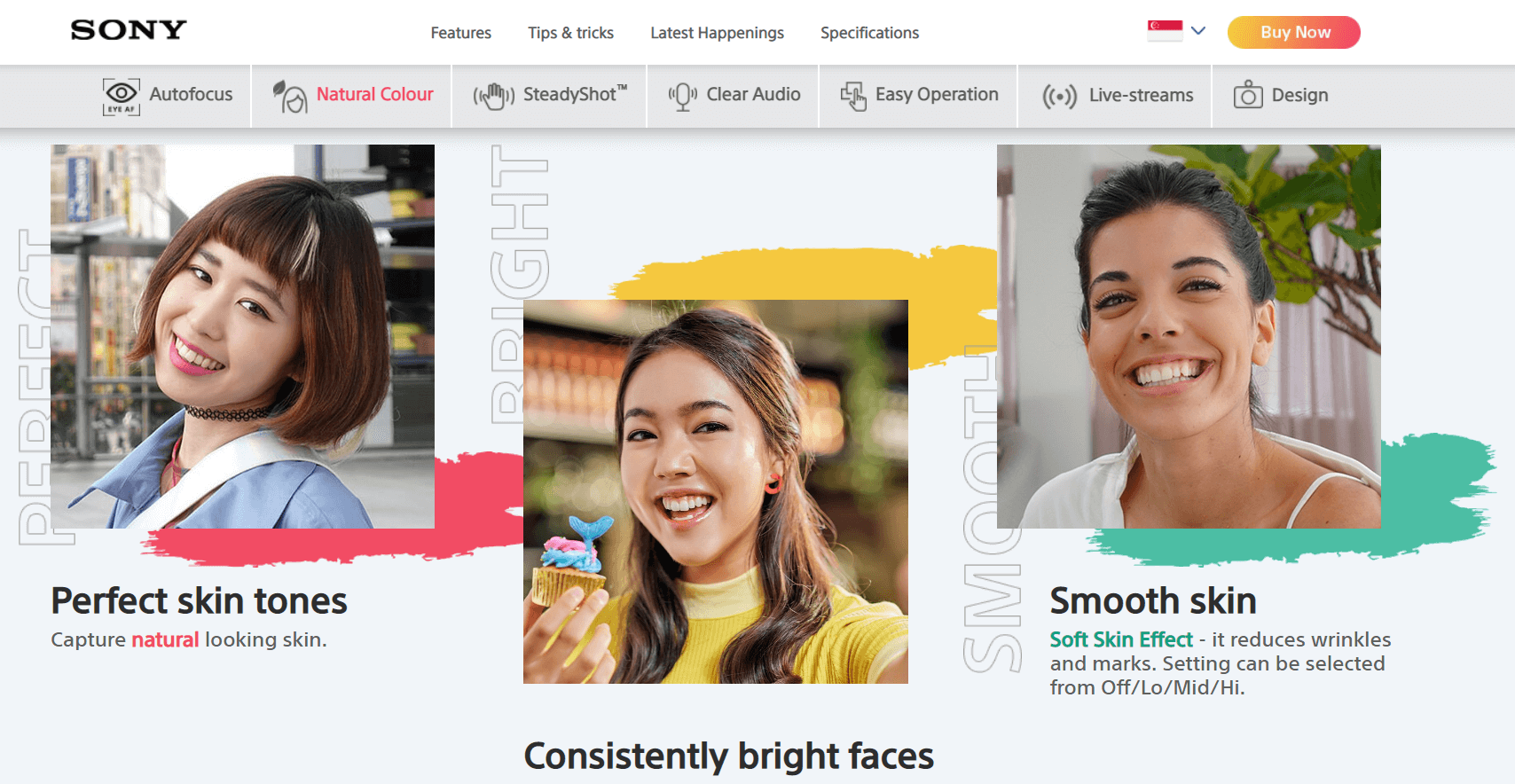
High-res images and graphics that demonstrate value
Pictures speak better than words but only if they’re not just decorative. So use relevant pictures that highlight the value your visitors can derive from carrying out the action you want them to.
Use schemes, infographics, screenshots (if dealing with apps or software), non-glossy pictures made by real customers who use the product. Cut off all extra copy if the pic speaks for itself.
Ensure your images are connected with the ad copy. There must be consistency in what you’re telling and what you’re showing.
List your actual offers
Internet users have a short attention span and always prefer to get the answers to their questions as soon as possible. If your services/products are not completely clear from the heading and subheadings, it helps to provide an added explanation of your actual services. These are not necessarily extensive details but short sentences listing out what you have for them.
Contacts or chat button (optional)
This feature is particularly helpful if your service is technical and visitors would likely want to have a chat with you or make a few inquiries before converting. Adding a live chat feature or a smart contact button assures them that you are available and more interested in meeting their needs than just making a sale.
Customer-friendly guarantees
Add a guarantee that promises them a good customer experience when they eventually convert. The type of guarantee depends on the purpose of your lander. Examples include 100% Money Back, No Spamming, 100 Days Warranty, Unsubscribe Anytime, etc.
A clear call-to-action
This is the point where they get to convert. Given all the factors you already put in place, a visitor who needs the said product, service, or information will be willing to convert. Attach a compact and clear CTA to direct them to take action.
Apple Podcasts stopped using the “Subscribe” CTA just because 47% of users thought that subscriptions cost money. They’ll use “Follow” instead. Such a tiny change can return huge conversions!
Your CTA should be related to the goal of the landing page. An idea is to contrast the color of the CTA text from the rest of the text on the page and make it bold enough to attract the readers’ attention.
| NEEDS REVISION | LOOKS BETTER |
| Learn more, Subscribe, Get access | Download now, Register for free, Try now, Get the bonus, Join the webinar |
Some neat CTA formulas to make your landing page high-converting
- Action verb (what to do) + time limit (when to do)
- Subscribe for free until 12AM, Download now
- Action verb (what to do) + Core benefit of the offer
- Download a free ebook
- Action verb (what to do) + Unique offer
- Register as VIP
- Get exclusive access
- Get PRO account
What a great lander should include
Apart from the landing page’s backbone elements, here are some points to remember when creating your landing page:
Your brand / product logo
Readers prefer to work with legit brands. A logo is one of the key brand signals that make your business credible.
Testimonials
A couple of short testimonials, reviews, and other related proofs of customer satisfaction go a long way. Gambling and cryptocurrency landers boast of having the best testimonials shaped as success stories. Consumer electronics brands often provide product reviews excerpts. Software providers expose highest security, speed, productivity marks given by users.
Countdowns, time counters
If you have a special festive offer or promo going on, using countdowns could help convince your visitors. However, the countdown should be valid and not just baits.
What is the difference between a landing page and a website page?
A lander differs from every other web page in several ways. Knowing these differences helps you decide which option will achieve your goal at each point in time.
- Here you get your web visitors to convert.
- You don’t redirect visitors elsewhere, so no extra links except the CTA.
- Landers convince, they don’t teach or describe.
- Simplicity means capacity; landers speak the language of the audience.
Which landing pages are truly high-converting in affiliate campaigns? Tons of insights on VPN, Subscriptions, Apps, Gambling landers in our partners’ case studies.
Types of landing pages
Sales pages
These are a common type of landers used to convince visitors to order or buy a particular product or service. They’re common for ecommerce, subscriptions, software verticals.
Lead pages
Publishers and affiliates tailor lead pages to generate leads (aka potential customers.) These pages contain forms that capture personal information from people, especially email addresses. The goal of the lead page is to convert visitors into leads and potential clients/customers.
Squeeze pages
Squeeze pages are used basically for email capture. The web publisher asks the visitors to submit their email addresses in exchange for some free information (it is called lead magnet). The visitors automatically count as newsletter subscribers.
Event landing pages
The event landers aim for obtaining information necessary to register an individual for a particular event, such as web summits, digital conferences, webinars, workshops, etc.
App landing pages
The app landing page is specifically designed to prove the value of an application in clear simple terms and what the potential users of the app stand to gain from downloading it.
The importance of a compelling landing page copy
For the most part, content determines what your lander will achieve. Your landing page copy goes a long way to helping visitors decide whether they want to convert or not.
Some landing page copywriting tips to bear in mind:
- Your landing content has to be relevant to the ad.
- The page should state benefits, not features.
- Keep it short and effective.
- Remember to keep the tone friendly.
- Make the CTA text/design impressive.
- Select clear fonts that work with all browsers and devices.
- It must speak to your audience—their pain points, motivation, biases, etc.
Is your landing page high-converting? Let’s give it a check!
There are several metrics to pay attention to when verifying the effectiveness of your landing page(s). Using Google Analytics, you can start with the number of views it garners. This will help you determine whether your ad campaign is worth the money.
Check out the sessions-by-source reports to see which channels are driving the most traffic. You could also set up events for tracking conversions or the number of leads generated.
Other metrics to check to include bounce rates, the average time on page, and top pages-based views. All these parameters allow you to determine how your landing page is performing compared to other pages.
Landing page = campaign efficiency with Adsterra
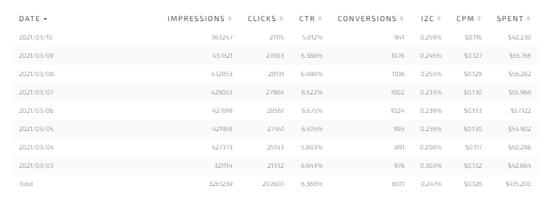
With Adsterra Statistics, affiliate marketers can track all conversions from the lander they lead traffic to. They can also add tracking tokens to get the best and worst-performing traffic sources. The key metrics for affiliates and advertisers are: impressions, clicks, CTR, spendings, conversions.
Lander = website efficiency on Adsterra
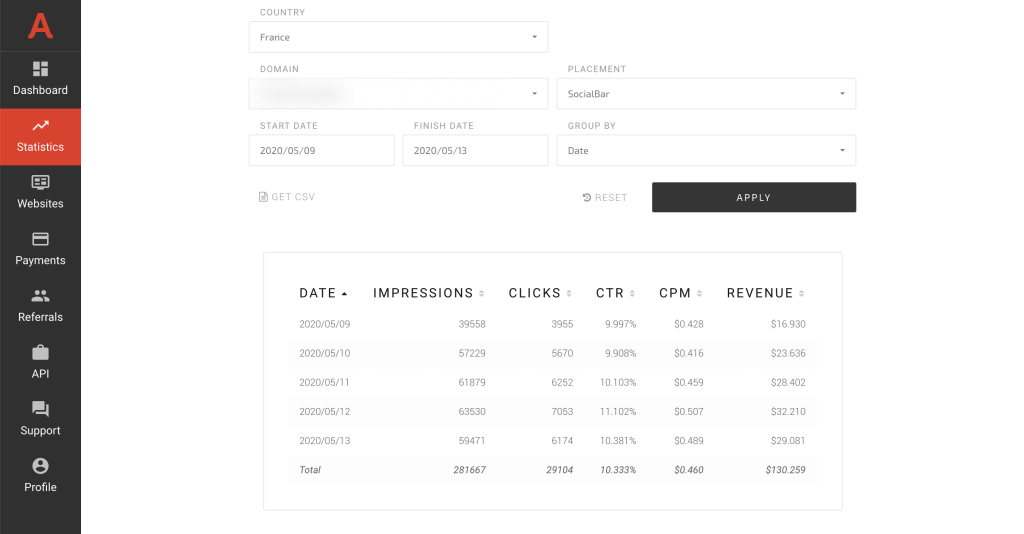
Publishers who put ads on their websites and landers, have full-scale statistics to monitor and manage their profit: impressions, clicks, CTR, CPM, and revenue.
Best practices in high-converting landing pages creation
1. Set one clear conversion goal
Do not mix up email subscriptions with events or sales. A single landing page should work for one product or category of products, depending on the offering in question.
2. Your lander should be relevant to the ads
Cloaking will not only increase your bounce rate but will make you risk a Google penalty. To make the best of your ad campaign, ensure the lander is completely relevant.
3. Your lander should be relevant to the ads
Keep in mind that digital customers have a very short attention span. Provide only necessary information on your landing page and keep the design simple. Use bold texts for emphasis — only where necessary. Anticipate the questions they are likely to ask and provide those answers.
If your product is complex, create an FAQ section available on click — don’t try to place all answers in your main copy.
4. Never direct ad traffic to your home page
Do not drive traffic from your promotional campaigns to your site’s home page. Generally, a home page is packed with all sorts of information, and there are usually a large number of different actions a visitor can choose from. They could get distracted on the home page and end up not taking that single action that counts.
5. A good lander follows a precise structure
Your headline is key, so craft a benefit-oriented text. Your landing page headline needs to correspond to the text of the ad and it must show viewers, at a glance, if it has the solutions or offers they need.
6. Make sure the language matches your target traffic
Double-check that your content is clear, concise, and relevant to your audience. Make sure the language (and dialect) of the ad also corresponds with that of the lander copy.
7. Use direct CTAs
While including a visible call to action, you need to use a clear font, distinct color, and appealing design. The one action you want the visitor to take has to be obvious. If the lander is long enough for scrolling, make sure to duplicate the form or button at the bottom of the page as well.
8. Remove all extra
Make sure there are no distracting navigation links, your main website menu, and so on. Remove all clutter from the landing page, including buttons, links, and menus that have nothing to do with the current ad campaign.
9. Maintain your brand signals
Design your lander(s) to align with the rest of the website. Use the same logo, font type, colors, etc. to maintain the look and feel of your main website. This is to raise awareness of your brand and boost your credibility.
10. Maintain your brand signals
Visitors might not always have the patience for a landing page that takes minutes to load. So make sure your page loads fast. You can use Google Page Speed to measure your load speed and get suggestions on how to improve it.
11. Make your landers responsive
Optimize your website to auto-adjust to fit the screen of all types of users, so everyone gets the best user experience on your lander irrespective of what type of device or browser they use.

Summary
Conversion is the soul of affiliate marketing and website monetization. Building high-converting landing pages is not rocket science, as you may have discovered. Keep in mind the core structure, use checklists of essential elements and triggers, and focus on one goal.
It often occurs that you don’t even need a great copy or testimonials. When your offer speaks for itself like those long-awaited Black Friday deals, all you need is to look credible and add powerful CTAs.
You probably have encountered one-screen landers from affiliate gurus with a heading and one CTA button. They work because they offer exactly what the audience is longing for. Shall your lander be like these or differ? You can always consult with Adsterra managers. With thousands of winning campaigns launched, they’re the best expertise source both for affiliates and publishers.