As a website owner or publisher, you must’ve come across the Core Web Vital section on Google search console. Most people ignore these metrics and go on with business as usual, thinking they’re just recommendations by Google. However, Core Web Vitals are key metrics used by Google to measure page experience and rank websites.
Great user experience leads to higher rankings and, subsequently, more revenue for you. In this article, we’ve simplified everything about Google’s core web vitals and how you can optimize them.
What are Core Web Vitals?
Core Web Vitals are page experience signals that assess a website’s user experience. Simply put, these signals indicate how quickly users will be able to interact with your website and the type of experience they will receive. These indicators –– Largest Contentful Paint (LCP), Cumulative Layout Shift (CLS), and First Input Delay (FID) –– also indicate how simple it is for users to navigate your website.
How Core Web Vitals Affect SEO
Page experience is an official Google ranking factor. And the user experience on a page is a mix of factors that Google considers important, including:
- Secure website with HTTPS
- Mobile-friendliness
- And Core Web Vitals
It’s safe to assume that core web vitals will account for most of your page experience score. But a high page experience score won’t automatically take you to the top of search results. Google clarified that page experience is one of several (approximately 200) factors they consider when ranking websites in search.
So, if you want to raise your Core Web Vitals in simple concrete steps, this article is for you. Let’s get into them in detail.
Largest Contentful Paint (LCP) — loading
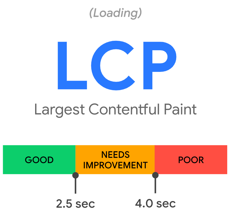
LCP measures how long it takes for the largest element (by pixel height) on the screen to load. For example, if you have a large logo, photo, or wall of text, above the fold, that will be the largest element. LCP is the largest visible element loaded in the viewport. The viewport is the area of a web page that is visible to the user. It varies depending on the device, and on a mobile phone, it will be smaller than on a computer screen.
The largest element is usually a featured image or the h1> tag, but it could be any of the following:
- Background image loaded with the URL() function
- Blocks of text
- <img> element
- <image> element inside an <svg> element
- The image inside a <video> element
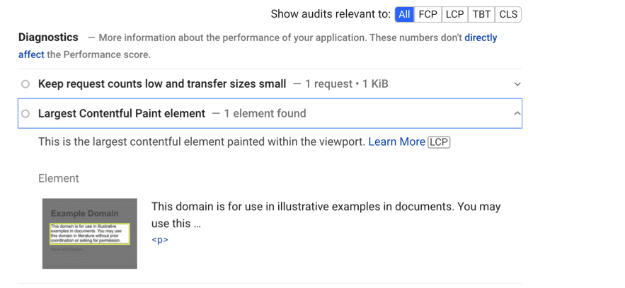
How to see a web page’s LCP
The LCP element is specified in the Diagnostics section of PageSpeed Insights.
Optimizing LCP
What must you do to ensure your LCP renders within the recommended 2.5 seconds?
- Make sure your LCP is just text on mobile. Push all images below the fold. Text loads faster than images because that’s what they are: just texts.
- Use 3-4 paragraphs of text before the first image. Use shorter sentences and bigger paragraphs.
- Increase font size and bigger line & paragraph spacing to optimize for accessibility.
- Don’t serve email-opt-in pop-ups for the first 5-10 seconds after the page loads.
- Switch to System or WebSafe fonts like Roboto and Arial. Avoid Google fonts or custom fonts because they are heavy and could slow down the page’s loading speed if your LCP is a wall of text.
- Cache your website’s assets by using a content delivery network (CDN). A Content Delivery Network (CDN) is a group of servers spread throughout the world. If your page’s content is hosted on a single server, your website will load slower for users who are farther away. But with a content delivery network (CDN), your users never have to wait for network requests to reach distant servers.
Cache assets
Caching can save you time if your HTML is static and doesn’t change with each browser request. Server-side caching reduces TTFB (Time to first byte) and saves resources by storing a copy of the generated HTML on disk.
Time to first byte (TTFB) indicates the responsiveness of a web server or other network resource. TTFB measures the time between an HTTP request (by user or client) and the first byte of the page received.
There are several methods to implement server caching depending on your toolchain:
- Set up reverse proxies (Varnish, Nginx) to serve cached content.
- Manage your cloud provider’s cache behavior (Firebase, AWS, Azure).
- Use a CDN with edge servers to cache content closer to users.
More steps
- Optimize and compress the images. Ideally, you should use the WEBp format.
- Reduce the size and dimensions of background images. (Or remove background images)
- Turn on lazy loading images in your CMS settings if possible. Every CMS, including WordPress, has add-ons (plugin/ apps) or an inbuilt lazy-loading function in the theme’s settings.
Minify CSS & JavaScript
Browsers parse HTML markup into a DOM tree before rendering any content. If it encounters any external stylesheets (<link rel=”stylesheet”>) or synchronous JavaScript tags (<script src=”main.js”>), the HTML parser will pause.
Both scripts and stylesheets are blocking resources, delaying FCP and LCP. Defer non-critical JavaScript and CSS to speed up page loading.
Reduce CSS blocking time # Use the following to ensure that only the bare minimum of CSS is blocking render on your site:
CSS files can include characters like spacing, indentation, and comments to make them easier to read. These characters are unnecessary for the browser, and by minifying these files, they will be removed. Reducing blocking CSS will reduce its time to render the page’s main content (LCP) fully.
Cumulative Layout Shift (CLS) — visual stability
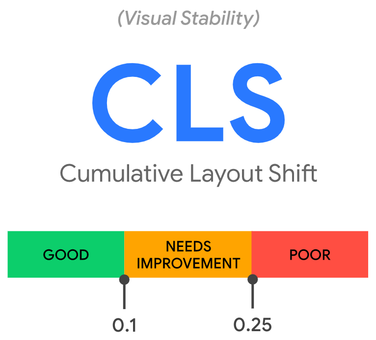
CLS measures how elements move around on a page and how stable the page’s layout is. It considers the size of the content as well as the distance it moves while loading. One major flaw in this metric is that it continues to track layout shifts even after the page has fully loaded.
A page that shifts can be annoying if you try to click something and end up clicking on something else. It irritates users.
Common causes of CLS include:
- Injecting content with JavaScript
- No-dimension images
- Embeds and iframes without dimensions
- Applying fonts or styles late
How to check CLS
Under Diagnostics in PageSpeed Insights, you can see a list of shifting elements.
Optimizing CLS
Developers used to add width and height attributes to their img> tags in the early days of the web to ensure that enough space was allocated on the page before the browser started fetching images. This would reduce reflow and re-layouting.
<img src=”adsterra-logo.jpg” width=”640″ height=”360″ alt=”Adsterra logo” />
You can see that width and height in the example do not include units. These “pixel” dimensions automatically reserve a 640×360 area, and regardless of whether the actual dimensions matched or not, the image would stretch to fit this space.
Web Developers began to omit width and height and instead use CSS to resize images when Responsive Web Design was introduced:
img {
width: 100%; /* or max-width: 100%; */
height: auto;
}
The disadvantage of this approach is that space for an image could only be allocated after it had begun to download and the browser had determined its dimensions. The page would reflow as each image loaded and appeared on the screen. It became common for text to appear on the screen out of nowhere. This was not a pleasant user experience.
Fortunately, aspect ratio comes into play here: an image’s width to height ratio. This is commonly written as two numbers separated by a colon (for example, 16:9 or 4:3). An image with an x:y aspect ratio is x units wide and y units tall.
This means that if we know one of the dimensions, we can figure out the other. For a 16:9 aspect ratio, use the following formula:
- If adsterra-logo.jpg has a 360px height, width is 360 x (16 / 9) = 640px
- If adsterra-logo.jpg has a 640px width, height is 640 x (9 / 16) = 360px
The browser can calculate and reserve enough space for the height and associated area when it’s given the aspect ratio.
Best practice
To avoid layout shifts, set the width and height attributes of your images to their default values. The CSS Working Group has made it simple to set width and height:
<!– set a 640:360 i.e a 16:9 – aspect ratio –>
<img src=”adsterra-logo.jpg” width=”640″ height=”360″ alt=”Adsterra-logo” />
…and all browser UA stylesheets add a default aspect ratio based on the element’s width and height:
img {
aspect-ratio: attr(width) / attr(height);
}
The aspect ratio is calculated using width and height attributes before the image is loaded. It gives this data right at the start of layout calculation. When an image is given a width (100%), the aspect ratio calculates the height.
If your image is inside a container, you can use CSS to resize it to fit the container’s width. To stop the image height from being a fixed value, set height: auto (for example, 360px).
img {
height: auto;
width: 100%;
}
Responsive images
With responsive images, srcset specifies which images the browser can choose from and what size each image should be. Each image should have the same aspect ratio to set the img> width and height attributes.
<img
width=”1000″
height=”1000″
src=”adsterra-1000.jpg”
srcset=”adsterra-1000.jpg 1000w, adsterra-2000.jpg 2000w, adsterra-3000.jpg 3000w”
alt=”Adsterra banner”
/>
Ads, embeds, fonts, and iframes without dimensions
The good news is that sites can reduce ad shift by using best practices. Websites can mitigate CLS changes by:
- Statically reserve space for the ad slot.
- Style the element before loading the ad tag library.
- Avoid placing non-sticky ads near the viewport’s top.
By reserving the maximum possible size for the ad spot, you can eliminate shifting.
This works. However, it risks leaving a blank gap if the position is filled with a smaller ad creative. Based on past data, determine the most likely size for the ad spot.
If the ad spot is unlikely to fill, some sites may find that compressing it at first reduces layout alterations. Unless you handle the ad serving yourself, there is no straightforward method to choose the exact size each time.
Statically reserve space for the ad slot
Style slot DOM elements statically with the same sizes as your tag library. This can assist ensure that when the library loads, there are no layout shifts. If you don’t, the library may adjust the slot element’s size after page layout.
Consider the sizes of smaller ad serves as well. The (bigger) container can be styled to minimize layout shift if a smaller ad is served. This strategy’s disadvantage is that it increases the quantity of vacant space.
Ads near the top of the viewport may change the layout more than ads in the middle. This is because ads near the top tend to contain more content lower down, which means more elements shift as the ad changes. Ads at the middle of the viewport are less likely to displace as many elements as content above it.
We have the Popunder format. Its code needs to be added to the website head. It doesn’t open ads on the page, but in a new tab.
We also have the Social Bar, which appears as a push notification or a chat window. You can set a delay for its appearance.
Do not immediately place a lot of banners on the first screen. Start with super lightweight formats: Popunders and SB. If you think that the appearance of the security system affects the speed, ask the manager to configure the delay.
Embeds and iframes
You can use embeddable widgets to include portable web content in your page (for example, YouTube videos, Google Maps, Instagram, FB media posts, and more). These embeds can appear in several forms, including:
- iframe embed
- Inline HTML snippet
- HTML fallback and a JavaScript tag that transforms the fallback into a fancy embed
These embeds are frequently unaware of the size of an embed in advance. For example, does a social media post have an embedded image or video? Is it multiple rows of text? As a result, platforms that provide embeds may not always reserve enough space for them, resulting in layout shifts when they finally load.
To get around this, provide enough space for embeds with a placeholder or fallback to reduce CLS.
Using your browser’s developer tools, measure the height of your final embed. Once the embed loads, the iframe’s content will resize to fit. Note the dimensions and style an embed placeholder accordingly. Using media queries, you can account for subtle differences in ad/placeholder size between form factors.
Fonts
Fonts cause layout shifts when the containing element size (e.g., a <div> or paragraph) changes as the web font is downloaded. This happens when the web font’s height or paragraph length is different from the system font’s. Even if you declare a web font to block the system font with font-display: block! Browsers will use the dimensions and properties of the fallback font to determine the size of the containing elements when rendering a page.
The easiest approach for detecting layout shifts caused by web fonts is running your website using WebPageTest and the filmstrip view. There’s a toggle to show layout shifts, which you can use in conjunction with ‘large’ sample images and a 0.1s interval to get a good picture of what’s going on while your website renders. ( Add this at the end of the URL: &highlightCLS=1&thumbSize=600&ival=100&end=visual&text=000&bg=fff”
The secret is that you can fix font-related layout shifts with just one line of CSS:
font-display: optional
This directive goes in your font-face declaration and directs the browser to use a system font as a fallback if the web font isn’t available when rendering text (plus 100ms). This implies that the fallback font may be used on uncached page loads, but the web font will be downloaded and available in the cache for all subsequent page loads.
Dynamic content
Avoid adding new content above existing content unless prompted by a user. This ensures any layout changes are anticipated.
When trying to load a website, the UI that appears at the top or bottom of the viewport may cause layout shifts. Similar to ads, banners, and forms that shift the page’s content often do this:
Here are some steps you can take to optimize CLS.
For any media (video, images, GIFs, infographics, and so on), use a specific size attribute: The user’s browser sees how much space that element will take up on the page this way.
And it won’t randomly until the page is fully loaded.
Make sure you reserve enough space for ads elements. Otherwise, they can suddenly appear on the page, pushing content down, up, or to the side.
Add new UI elements below the fold: That way, they don’t push content down that the user “expects” to stay where it is.
Summary:
- Preload web fonts.
- Add width and height size attributes to images, videos, map elements. This will be set automatically in most CMS. However, you can use CSS to include the width or height attribute aspect ratio if yours does not do this by default.
- Add new UI (checkboxes, pop-ups, etc.) elements below the fold.
- Define Space and Size for Ad Slots, Embed, and iFrames.
- Assign fixed dimensions to your ads so that there is enough room for them to load.
- Leave as much room as possible for ads, embeds, and iframes.
- Keep enough for elements that have yet to be displayed. In other words, no area of the viewport should be collapsed. Use a placeholder or a fallback element instead.
First Input Delay (FID)
FID is the time it takes your page to respond when a user interacts with a website. This does not include scroll or zoom.
Interactions include:
- Choosing from a menu
- Clicking a navigation link
- Entering email into a field
Google values FID because it considers how real people interact with websites. Like FCP, they have specific criteria for acceptable FID.
Yes, FID measures how long something takes on a page. So it’s a page speed score. It also measures the time it takes for users to do something on your page.
FID isn’t a big deal for a page with only content (like a blog post or news article).
FID is important for login, signup, and other pages where users need to click something quickly.
Consider the following page’s loading experience:
With a login page like that, loading time isn’t important. It’s all about how fast users can go through the login process.
With that, here are some things you can do to improve your site’s FID scores.
- Minimize (or defer) JavaScript
- Remove any non-critical third-party scripts
- Use a browser cache
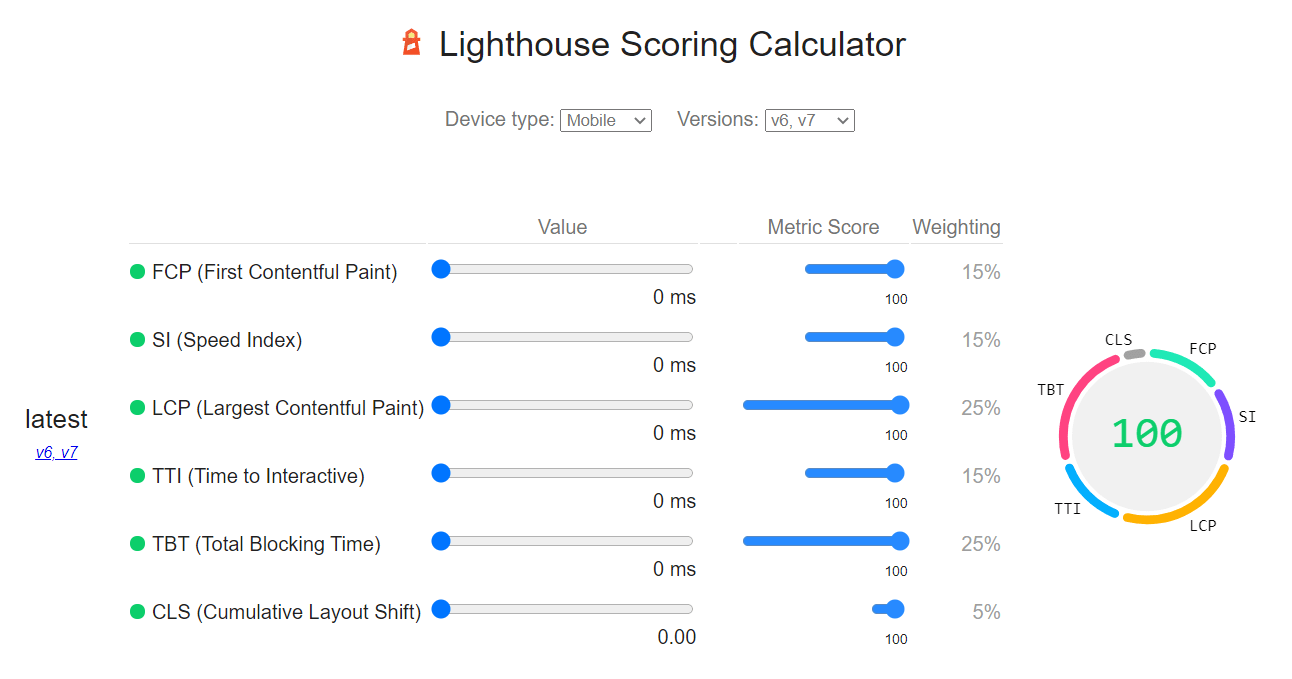
Tools for measuring Core Web Vitals
The difference between lab and field data is that field data considers real users, network conditions, devices, caching, and so on, whereas lab data is tested repeatedly under the same conditions in the hopes of repeatable results.
Field d
Field data
Lab data
| LCP | FID | CLS | |
| Chrome DevTools | Yes | no (use TBT) | Yes |
| Lighthouse | “ | no (use TBT) | “ |
| WebPageTest | “ | no (use TBT) | “ |
| PageSpeed Insights | “ | no (use TBT) | “ |
| web.dev | “ | no (use TBT) | “ |
Total Blocking Time (TBT) measures the total time in milliseconds between First Contentful Paint (FCP) and Time To Interactive (TTI), during which the main thread is blocked long enough to become unresponsive to user input.
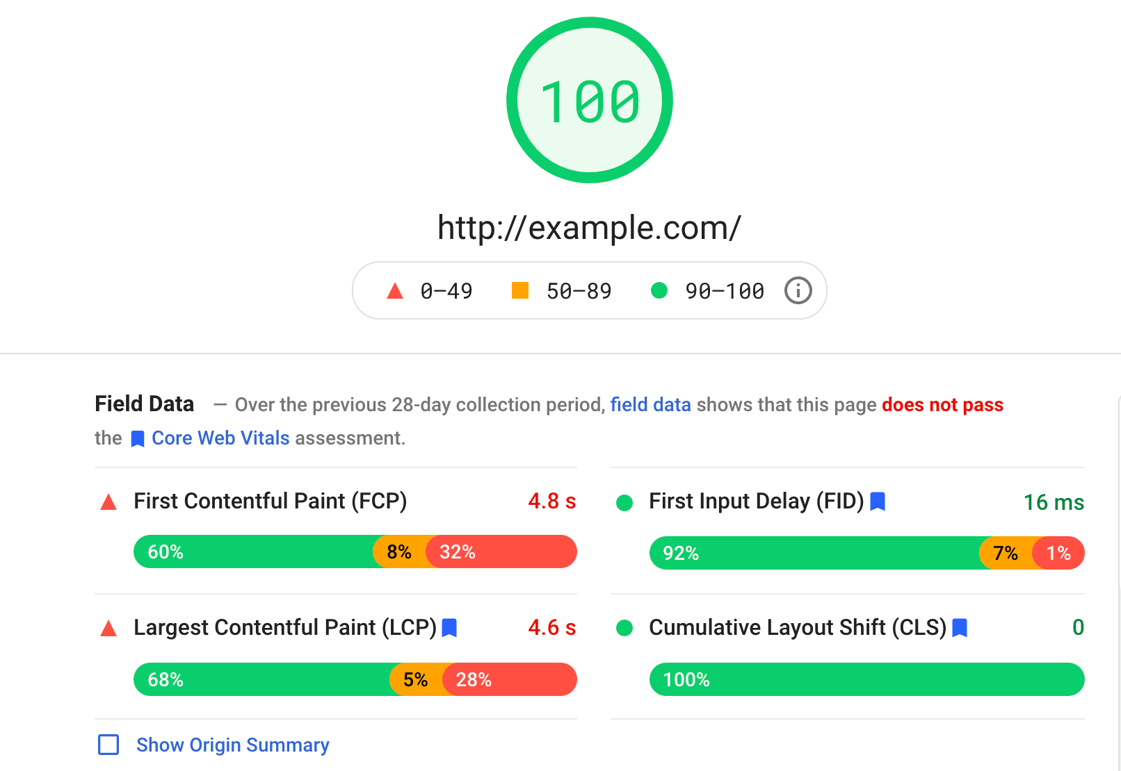
The report Google Search Console is helpful because it shows data for multiple pages at once, but the data is delayed and on a 28 day rolling average, so changes may take time to appear. Lighthouse’s scoring weights can be found at any time and tracked over time.
Final thoughts
Core web vitals remain a complex topic for both web developers and publishers. But they’re a crucial move toward making the internet a better place for more users. These metrics will always be a part of Google’s ranking algorithm.
Even if you don’t see any problems right now, you should keep an eye on them. On that note, here’s a quick rundown of things to keep in mind in the future:
- Based on the previous 28-day period, Google determines whether your site passes the Core Web Vitals audit. So test your website at least once a month.
- Focus on field data when testing because it accurately reflects how real users interact with your site.
- Use PageSpeed Insights to learn how a specific page performs.
- Use Google Search Console to identify common web vitals issues in groups of pages.
Check out Google’s guide for more info.