
Did you notice that a good percentage of your competitor’s organic traffic comes from mobile users? The secret is having mobile-friendly websites. you worried that your website doesn’t look great on smartphones, iPads, tablets, and other low-resolution displays?
Smartphones evolved from being expensive, exciting new technology to a part of our daily lives in a decade. Now it seems unusual to leave the house without your smartphone.
For website owners like you, this means it’s long past time to make your site mobile-friendly. Mobile web usage surpassed computer usage for the first time in 2016. This trend has only gotten more serious ever since. Smartphones now account for more than half of all global website traffic.
Why your website must be mobile-friendly and responsive
Google’s mobile-first indexing
The term “mobile-first indexing” refers to indexing that prioritizes mobile devices. While you are thinking or calculating what percentage of your traffic comes from mobile devices. Google has prioritized mobile search results. There is no turning back. Mobile optimization is inevitable and an excellent opportunity to rank top 10 in the search results while your competitors are slacking.
While website traffic distribution varies by website, approximately half of your visitors are likely to be viewing your website on a phone’s small screen. It is now mandatory to have a mobile-friendly website. You’ll lose a large portion of your traffic if your mobile visitors have a bad user experience on your site. And damage your search engine rankings in the process. In a nutshell, your site’s website design impacts its appearance on search results.

Since the first Mobile-friendly update in April 2015, dubbed ‘Mobilegeddon’ by the SEO community, mobile devices have been a shifting focus for Google.
Google has retired desktop crawling and now indexes all websites using mobile-first indexing since March 2021. This means that you should quickly determine if your website is ready for mobile crawling. This article contains several recommendations for optimizing your site for mobile-first indexing.
Is my website already responsive to mobile devices?
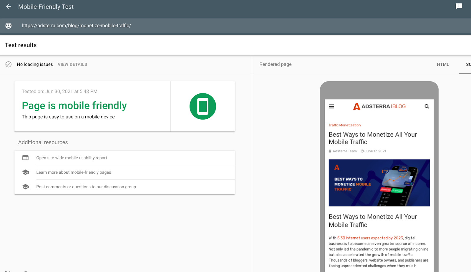
Suppose your website was created or updated after 2015. In that case, the designer or website builder might have prioritized the mobile experience. Before worrying about making your website mobile-friendly, you can check with Google’s mobile-friendly testing tool.
Simply enter your URL in the search box and see the results. You’ll get a quick answer as to whether or not your website is mobile-friendly. You’ll also see a screenshot of how your web page appears on a smartphone screen and a list of suggestions for improving the mobile experience.
If you see that your website is not mobile-friendly, then improving it must be a top priority. This will help you improve your website’s search engine visibility, increase the number of organic visitors, and increase conversions.
But if your website is already mobile-friendly, you may still benefit from our tips on improving your users’ mobile experience. Every little bit contributes.
Make Your Website Mobile-Friendly in 12 Easy Steps
Here are a few things you can do right now to ensure that mobile visitors enjoy a good user experience as much as desktop users.
1. Make Your Website Responsive
According to most web design experts, building a responsive site is the best way to ensure a website that serves both desktop and mobile users well.
A responsive website has the same content and information on any device you use to access it. Still, it responds to the device you’re using and adjusts its appearance accordingly.
In other words, the size of the device screen affects how a page displays texts and images. For example, an image that appears next to a text block on a desktop screen may appear in a single column on smartphones.
You can make your website mobile-friendly without hiding information from your mobile visitors. This means that they’ll get the same content but in a different arrangement. Responsive design is also beneficial to SEO.
Alternatively, go for the most straightforward option and use a website builder with a responsive template.
Mobile responsive themes in WordPress
If you’re using WordPress to build your site, make sure the theme you choose is mobile-responsive. Or, if you already have a WP website, switch to a mobile responsive theme.
Simply look for a responsive theme in the WordPress theme library or on a third-party site like Themeforest. Make sure to read reviews and, if possible, visit any sites that use this theme on your mobile to get a first-hand experience.
How to enable Mobile responsiveness on a non-responsive theme
If you can’t change your website’s theme or template because it’s old and non-responsive, try adding this line of code to each page’s <head> tag:
<meta name=”viewport” content=”width=device-width, initial-scale=1″>
This code will automatically reformat your web pages to fit the device’s width, switching from landscape to portrait mode.
2. Make it easier for people to find the information they’re looking for
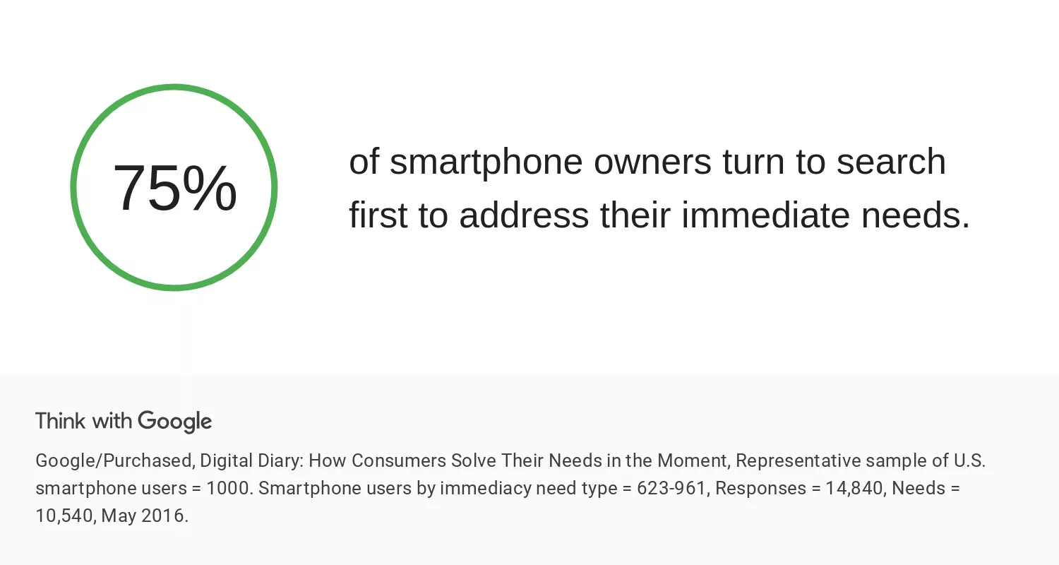
People frequently use their smartphones to look for specific information, such as a question’s answer, a nearby restaurant’s address, or a customer service phone number. They want to find information as quickly and efficiently as possible in these situations.
Consider what information your mobile visitors are most likely to seek when they arrive at your site, and place it prominently and easily accessible on the mobile homepage.
Think about the most common questions people have when they visit your website. You don’t have to put all the answers on your mobile homepage, but make sure they’re easy to find and navigate to.
Use your analytics tools to see what your mobile visitors are looking for when they visit your site. Add Mobile Traffic as a segment in Google Analytics’ Behavior section to see how mobile visitors interact with your website.
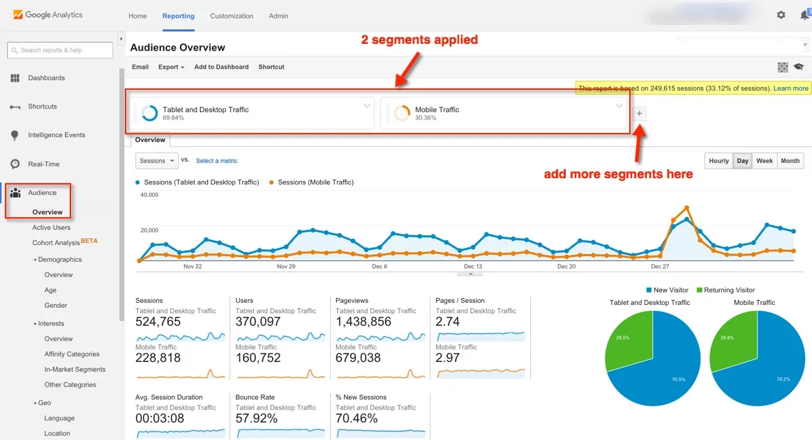
How to see mobile web traffic in Google Analytics
If you own a small website and your menu is frequently searched for on mobile devices, consider redesigning your site to make it easier to find. Add your contact information to the bottom of your home page if your visitors frequently visit that page.
Reducing the steps they have to take to find necessary information improves their overall website experience.
3. Display ads in suitable formats on mobile devices
It’s great that you’re monetizing your content, but don’t let it interfere with the mobile experience. Nobody likes distracting ads in any situation. It’s especially annoying when you’re trying to read text on a small screen, and a large ad or pop-up blocks your view.
Most visitors will simply leave and go to another website rather than looking for the little X to close the pop-up. If you feel they’re too important to remove entirely, use more suitable ad formats to display ads.
Read more on how to monetize your website for mobile users
4. Prioritize website speed
Can you remember the days of waiting for websites to load slowly? Now it seems that everyone expects faster internet speeds. If your website loads slowly, your visitors will not be patient enough to wait.
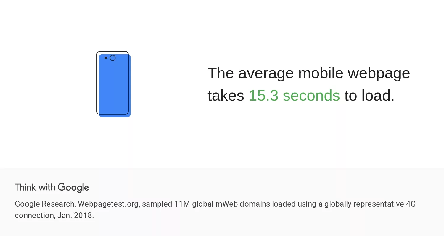
According to Google’s research on mobile loading speeds, most websites take more than five seconds to load fully. But no one is willing to wait that long when there are hundreds of other (probably faster) sources.
To improve your mobile site speed, website owners can apply different strategies.
- Use AMP (Accelerated Mobile Pages). AMP is a Google-endorsed framework for reducing the time it takes for your mobile web pages to load. Get AMP plugins in WordPress or AMP apps for other CMS and website builders.
- Compress your CSS and images: The parts of a web page that take up the most space and load the slowest are the ones that contain high-resolution images and CSS. You can reduce the time it takes for a website to load by compressing image file sizes to load faster without compromising their quality. Check out our guide on using images in your blogs.
- Evaluate your web hosting package. Slower load times can be a drawback if your website has outgrown the web hosting plan you started with or started with (Congratulations!). Upgrade to a web hosting plan that meets your current needs to speed things up.
5. Keep Your Web Design Simple with Website Builder
On big screens, complicated websites with a lot of clutter are confusing. But on a tiny mobile phone screen size, they make it even more difficult for visitors to navigate your site.
Keep clutter to a minimum. Maintain a clean, minimalist design that allows people to find what they’re looking for quickly. A simple design also contributes to faster load times by having fewer files on each page that need to be loaded. If your website has many pages and categories, a large menu on desktop screens might be useful.
However, on a mobile device, you’ll want to narrow it down to the most important options. On mobile, some websites hide their menus behind a hamburger button. It takes up less room on the screen this way, and visitors can click to open it if they need it.
6. Make your buttons big enough for mobile users
It’s easy to click on a button of any size with a mouse, but small buttons are difficult to deal with on a small smartphone screen. Using larger buttons is the best way to relieve this frustration for your visitors. Also, think about where you’re going to put them on the screen.
Take time to test out new buttons you add to your site (and any that are already there) on as many mobile devices. Make sure that clicking each button is simple on all devices.
7. Use large fonts
If the font is small, reading on a small screen becomes even more difficult. On your web pages, it’s best to use a font size of at least 16px, but you can experiment to see if going larger would be better.
It’s also a good idea to use standard fonts. Any fonts that a browser will have to download before rendering your website are bad news for mobile users. Check out our guide on the best free font websites.
8. Avoid using flash
It is a rookie SEO mistake to use flash throughout your website. It increases page load time, and it doesn’t work in a lot of browsers and devices. Because neither Android nor iOS devices support flash, if you build a website that relies on a flash animation in any way, your mobile users will be left out.
If your website was built more than a few years ago, you might still have some features that rely on outdated flash technology.
9. Don’t forget to use the Viewport Meta Tag
The viewport meta tag allows you to control how your website appears on mobile devices easily. You’ll have to awkwardly scroll from side to side to read each line of text and see the different sides of the page if your page opens up the same width on your phone’s small screen as it does on your desktop. The viewport meta tag instructs browsers to resize your page to fit the visitor’s device screen.
It’s easy to include this into your HTML source code. Simply copy and paste the following into the HTML for each page:
<meta name=”viewport” content=”width=device-width, initial-scale=1″>
10. Disable Autocorrect in Forms
Autocorrect has its advantages, but website owners frequently overlook how it ruins users’ interaction with their websites.
If you have forms on your website that demand name or address information, turn off autocorrect for each form field.
Otherwise, their phone will keep “correcting” their name or street name to more common words, slowing down the conversion process.
Make sure to include autocorrect=off in the HTML for the input field.
Make sure your forms are short if they aren’t already. Don’t make visitors provide any more information than is absolutely necessary. If a form takes too long to fill out or requires information that a visitor doesn’t want to share, they won’t bother, regardless of which device they’re using.
11. Make it possible to switch to a desktop view
Some of your mobile visitors may prefer to view your site’s desktop version on their smartphones. If that’s what they want, give them a way to do it. You want your visitors to be able to interact with your website in the most natural way possible. It’s all part of having a mobile friendly site.
12. Conduct mobile testing regularly
The best way to ensure that your website provides a good mobile experience is to regularly test it on your mobile device. Check your website on your phone or tablet every day and spend some time browsing around to find room for improvement.
Regular testing is the best way to catch minor issues that can degrade your visitors’ experience. The sooner you notice them, the sooner you can make changes to your website to make it truly mobile-friendly.
Conclusion
- Mobile-friendly websites rank higher in search results.
- Mobile searches account for more than half of all searches on Google.
- The majority of traffic for many advertisers comes from people using their mobile phones.
- Visitors are 5 times more likely to abandon your site if it is not mobile-friendly.
- Mobile-first UX requires mobile-first ads, so experiment with advanced formats like Social Bar.
Mobile devices are always changing, so your responsive website today might not be enough tomorrow. Keep testing, tweaking where necessary, and keep your mobile users in mind as a priority, and you should be fine.