Banner ads are effective for monetizing your website. They perform greatly because of their high visibility. The size of a Banner ad is critical to website monetization. Misusing or misplacing the format can result in revenue drops. This guide will teach you the best Banner ad sizes for maximizing your website revenue.
What are Banner ads?
Banner ads are effective for monetizing your website. They perform greatly because of their high visibility. The size of a Banner ad is critical to website monetization. Misusing or misplacing the format can result in revenue drops. This guide will teach you the best Banner ad sizes for maximizing your website revenue.
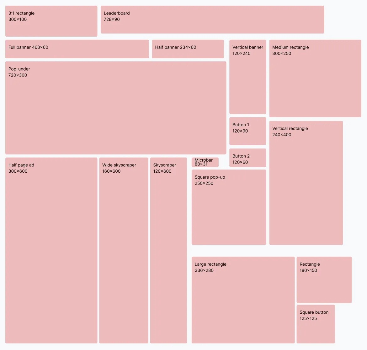
Banner ads are very visible to anyone scrolling through a website. Hence, advertisers don’t hesitate to pay premium prices for Banner ad slots on high-traffic websites.
Want profitable Banner ads for your website? Adsterra has you covered in many dimensions. Join our network of publishers benefitting from $87 million+ in annual payouts.
Why are Banner ad sizes important?
The size of a Banner ad determines its visibility. It plays a crucial role in conveying promotional information to your website visitors. For example, a 320 x 50 banner size is ideal for a mobile display but too small for a desktop. A 300 x 600 ad fits a laptop screen but is too large for a mobile display. Publishers should pay attention to standard banner dimensions when placing ads on their websites.
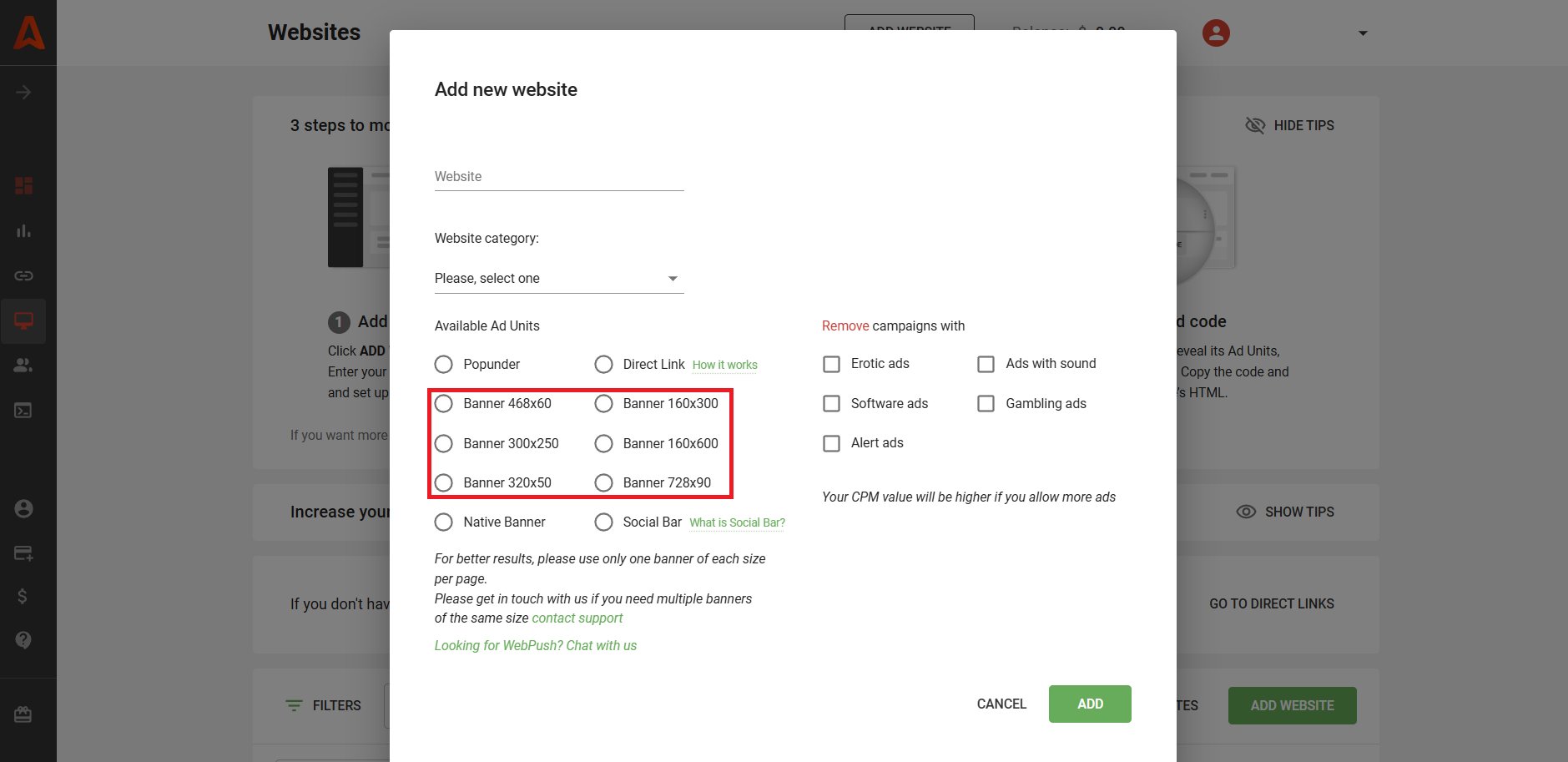
The best ad networks offer a broad range of Banner ad sizes. For example, Adsterra offers 160 x 300, 160 x 600, 300 x 250, 320 х 50, 728 x 90, 468 x 60, among others.
How does Banner advertising work?
Banner ads promote products to your website visitors and urge them to click a call-to-action button. It gives catchy information about a product or service, encouraging the visitor to click on the ad for more information.
When users visit an advertising page and convert, publishers get paid. Website owners can also earn from clicks and Banner ad views, i.e., the cost-per-mille (CPM) model.
Many publishers choose Banner ads because they’re easy to set up and get higher conversion rates than other ad formats. You just need to sign up for an ad network, get an ad code, and place the code in the appropriate position. Viola! A Banner ad goes live on your site, and you can start making money.
How Banner ads benefit publishers
Publishers can sell Banner ad slots on their websites to businesses. The easiest way is to sign up for an ad network that links the publisher with high-quality advertisers. Here’s an overview of how to put ads on your website:
- Sign up for an ad network, such as Adsterra.
- The ad network provides a code snippet to add to a website.
- The publisher places the code on the appropriate Banner position.
- The code automatically displays Banner ads on the publisher’s website.
- The publisher earns money when users perform desired actions.
How Banner ads drive results for advertisers
Advertisers love Banner ads because of their high visibility and conversion rates. They find websites with their ideal target audience and promote their products on these websites. The easiest way for advertisers is to join an ad network that links them with the best publishers.
- Join an ad network.
- Adjust targeting settings: choose country, traffic type, device, etc.
- Provide the pictures and videos for the Banner ad. Advertisers can adjust the graphics for different web Banner dimensions.
- The Banner ads will be automatically placed on the targeted websites after your campaign is approved.
- The advertiser pays the publisher based on the pricing type. It can be CPM (payment for 1,000 ad impressions), CPC (payments for clicks), or CPA (cost per conversion). Every ad network provides pricing types for traffic acquisition.
Most popular banner ad sizes for websites and mobile
Ad networks have standard Banner dimensions for publishers and advertisers. These dimensions are different for mobile and desktop displays. Let’s explore the common web banner sizes you can choose as a publisher.
Standard website Banner ad sizes
- 970 × 250 (Billboard). This Banner ad dimension is large enough to catch the user’s attention and convey the advertiser’s information. It’s displayed prominently at the top of a website, spurring high engagement.
- 970 × 90 (Wide horizontal Banner). This has the same width as the Billboard but a significantly smaller height. It’s highly visible at the top of a website, although it conveys less information than the Billboard.
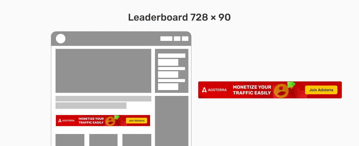
- 728 × 90 (Leaderboard). This dimension has significant width and height, letting advertisers pass much information to website visitors. It’s often placed at the top or bottom of a website.
- 468 × 60 (Full Banner). A horizontal Banner dimension that’s cost-effective and popular with advertisers.
- 300 × 1050 (Vertical Banner). This is a vertical ad placed on a website’s left or right side. It is highly visible and engaging.
- 160 × 600 (Skyscraper). As the name suggests, this vertical ad is placed on a website’s right or left side.
- 120 × 600 (Narrow Skyscraper). This is a narrower format of the vertical Skyscraper ad, which advertisers highly favor.
- 160 x 90. This is a small vertical banner for desktop and laptop displays.
- 300 × 600 (Half-page). This large half-page ad enables advertisers to convey much information.
- 336 × 280 (Large rectangular Banner). This is a rectangular ad often placed on a website’s sidebar.
- 300 × 250 (Medium rectangular ad). This dimension is popular with advertisers because it blends well with other website blocks.
- 250 × 250 (Square). This small square ad is often used in place of the medium rectangular ad.
Standard mobile Banner sizes
- 320 × 480. An ad that covers the entire mobile screen. The visitor always views this ad because of its large size, so advertisers are willing to pay high prices for it. However, such banners are pretty distracting. A more user-friendly alternative is the Interstitial ad.
- 300 × 250 (Medium rectangle). This dimension is highly visible on mobile displays, especially tablets, making it command high prices from advertisers.
- 320 × 100 (Large mobile Banner). A top-performing, visible Banner for mobile devices.
- 300 × 50 (Small mobile Banner). This is a smaller Banner that fits perfectly on mobile screens. It is similar in size to Push ads.
The most common Banner ad sizes
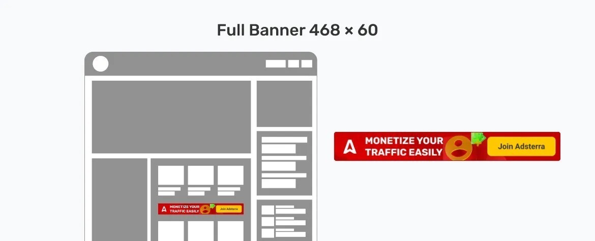
1. 468 × 60 (Banner)
This Banner ad size is commonly found at the top of a web page. Initially, it was so popular that it became synonymous with the word “Banner.” However, it has lost some sheen because it’s considered too small for modern device screens, which are much larger than a decade ago.
2. 728 × 90 (Leaderboard)
Leaderboard Banners are the go-to replacement for the 468 × 60 Banners. Their larger size makes them more suited for modern screens. It’s one of the top-performing ad sizes on most websites, and Adsterra offers it.

3. 300 × 250 (Medium rectangle)
This Banner ad size is commonly found on mobile displays but also works well on desktops. It appears at the top, bottom, or within text on a web page. According to Google, it’s one of the top-performing ad positions on web pages. Adsterra offers premium Banner ads of this size.

4. 336 × 280 (Large rectangle)
This is the upsized version of the medium rectangle Banner. It offers more visibility, which leads to higher conversion rates. However, many Display advertising networks do not offer this size.

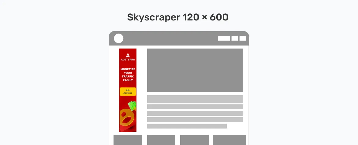
5. 120 × 600 (Skyscraper)
This slim, vertical ad covers a sizeable part of a web page. Visitors see the ad even while scrolling down on a web page. It’s highly visible and engaging, making it command premium prices from advertisers.
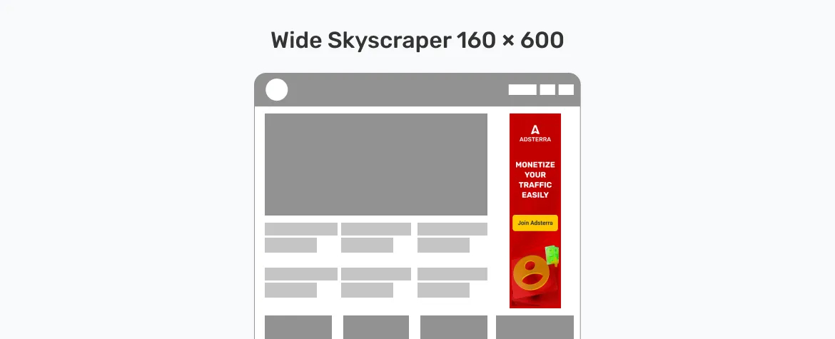
6. 160 × 600 (Wide skyscraper)
This is the bigger brother of the skyscraper Banner. It covers almost half of a page vertically, so visitors have no choice but to notice it. This ad size is perfect for interactive visuals. Adsterra offers high-paying ads of this size.
Source: Yahoo Ad Specs
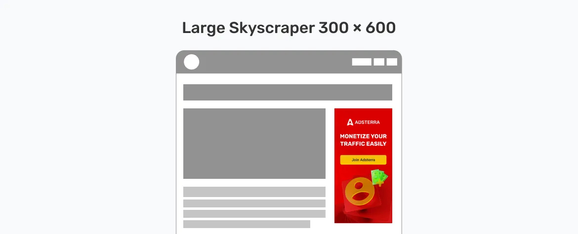
7. 300 × 600 (Large skyscraper)
This Banner ad covers half a page. Because of its enormous size, it’s called the monster page unit (MPU). It’s one of the best ad units in terms of conversion rates.
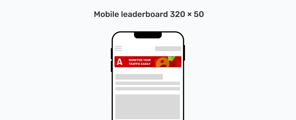
8. 320 × 50 (Mobile leaderboard)
This is the mobile version of the Leaderboard Banner. It appears at the top or bottom of a web page on a mobile device and is highly visible and engaging. Advertisers don’t hesitate to pay premium prices for this valuable advertising slot.
With thousands of advertisers and $87 million+ in annual publisher payouts, our platform provides ample opportunities for publishers to earn revenue from various Banner ad sizes.
Best practices for Banner sizes: publisher’s guide
When you create ads yourself or can adjust their visuals:
1. Simplicity is the key
Banner ads should be visually simple. Any images and text should be adequately spaced so visitors can understand it at first glance. Use one or two fonts at most, and avoid using heavily stylized fonts that are difficult to read.
A Banner has limited space, but that does not mean you should cramp as many elements as possible. Advertisers can pass their message in a few words– quality trumps quantity in marketing.
2. Use high-quality visuals
The images and videos on Banner ads should be in the highest possible resolution. High-quality visuals make a Banner ad look more professional and boost conversion rates. You’re more likely to make money with Banner ads that have high-quality visuals.
3. Optimize loading speed
High-resolution images are great, but their larger file sizes can slow a website’s load time. Images and videos of greater size take longer to load on a user’s device. However, you can mitigate this issue by compressing images to their lowest possible size while retaining quality.
You can choose from a broad range of free and paid image compression tools. Examples include Optimiziller, TinyPNG, and Adobe Lightroom.
4. Maintain a visual hierarchy
Your visual elements should have a logical hierarchy. The headline, logo, brand name, product images, and call-to-actions should be prioritized. These elements should be very visible to the viewer, while other elements can take the back seat.
Most website visitors spend a few seconds glancing at an ad, so you need to give them something memorable. The logo, headline, brand name, product image, and call-to-action determine whether they respond to or ignore the ad.
5. Make responsive designs
The visual elements on a Banner ad should be responsive, i.e., automatically adjust to different screen sizes. Mobile responsiveness is critical, as mobile phones constitute over 50% of internet traffic. Banner ads should fit well on both desktop and mobile displays.
When you add third-party advertising codes
6. Use different Banner sizes
There’s no strict rule to use a single Banner ad size on your website. You can combine different web Banner dimensions to maximize your revenue. For example, you can place a 728 × 90 Leaderboard Banner at the top, a 160 × 600 Skyscraper at the side, and a 300 × 250 Medium rectangular ad between text.
Combining different Banner dimensions lets you maximize your revenue from different audience segments. For example, the Billboard Banner will get more conversions from desktop users, while the Square Banner will get more from mobile devices.
7. Combine Banners with alternative ad formats
Publishers can use Banners along with other ad formats to boost their earnings. For instance, you can use Adsterra’s Banners along with Popunders or Social Bars. These alternative formats have high engagement and conversion rates. Better off, they’re less distracting for the viewer, unlike Banners where too many slots can annoy website visitors.
Using one or two Banners plus a Popunder or Social Bar helps maximize your earnings and minimize distractions. It offers a more intuitive experience for your website visitors, encouraging them to revisit your website. For more information, you can view our guide to ad formats for publishers.
Adsterra offers responsive Banner ads that fit perfectly on different screen sizes. Join our network and gain access to 15,000+ high-paying advertisers for your website.
Advertiser’s guide to choosing the best Banner ad sizes
1. Target audience
The first thing to consider when choosing Banner ad sizes is your target audience. Think of the demographics and their relevant online habits. For example, young people are likelier to visit the web from a smartphone. If you’re advertising a product to a young audience, focusing on mobile Banner ad dimensions is wise.
If you aren’t targeting a specific age range, you can use larger sizes suited for desktop and laptop displays. Regardless, most internet traffic now comes from mobile devices, so this aspect shouldn’t be ignored.
2. Position
Different Banner sizes are suited for different positions on a web page. For instance, the 728 × 90 Leaderboard Banner is perfect at the top of a web page. Having this large Banner at the side of a web page will be odd.
Source: The Online Advertising Guide
Similarly, the 250 × 250 Square Banner is best placed at the side of a web page. Having this small ad at the top won’t get the desired results. The larger a Banner ad is, the costlier it is for an advertiser. However, this cost is worth it because of the increased visibility and conversions.
3. Budget
We hinted at budgeting in the preceding factor. Before making a final decision, consider the cost of your desired Banner ad size. Larger Banner sizes usually cost more, but several other factors contribute to the price—for example, websites with high traffic charge much more for the same Banner dimension than other sites. Websites in specific niches like Finance tend to have higher prices than others.
A Banner ad can cost anywhere from a few cents to a few dollars per click (CPC) or thousand impressions (CPM).
4. Messaging
Your promotional message is another vital factor affecting your ad size choice. If you need to pass a fairly long message, choose a large Banner size like the 728 × 90 Leaderboard or 160 × 600 Skyscraper. Selecting a 300 × 250 Medium rectangular Banner won’t suffice: it might look cramped and annoy the viewer.
Yet, it is advisable to convey your message in as few words as possible. Short, precise text is better than long text with little focus. For example, look at the Banner ads below from the music streaming app Spotify. The dimensions are small, yet they convey a clear message to the viewer.

Conclusion
Banner ads have standard sizes across many ad networks. The key is choosing an ad network that offers the best sizes and adhering to the best practices for Banner ads.
Adsterra connects advertisers and publishers to help both parties profit from promoting goods and services. Choose the best-matching ad format and start selling or buying traffic today!
Banner ad sizes FAQs
What are some tips for designing banner ads?
“Simpler is better” is the golden rule when designing Banner ads. All visual elements should be adequately spaced and easy to understand. Use as few words as possible to convey your value proposition. Always insert an enticing, bold call-to-action button that tells viewers how to respond to the ad.
What is the standard size of a Banner ad?
Banner ads come in different standard sizes, with the most common being 970 × 250 (billboard), 160 × 600 (skyscraper), 728 × 90 (leaderboard), and 468 × 60 (small horizontal).
What is the best size for a web Banner?
The best sizes for web page Banners include 728 × 90 (leaderboard), 300 × 250 (medium rectangle), 336 × 280 (large rectangle), and 300 × 600 (half-page).
Do mobile Banner ads have specific sizes?
Yes, mobile Banner ads have standard sizes. These include 300 × 250 (medium rectangle), 320 × 100 (large mobile Banner), and 300 × 50 (small mobile Banner).
